Authoring Best Practices Guide
Overview
Digital Hive provides a very robust, zero code, authoring experience that enables authors to create visually stunning and impactful end user applications, called Hives. While the authoring process is very easy and intuitive, there are numerous best practices and techniques that can be applied to improve both the functionality, quality, and visual appeal of each Hive. All of the sections provided within this article are meant to offer guidance for authors looking to maximize the impact of their Hive designs, and don't specifically get into the implementation steps. These are not mandatory design guidelines and any number of sections can be leveraged to accomplish the desired end result.
Have an Initial Design Concept
This is the area where most Hive designers struggle with the most. A Hive starts as a blank canvas and the possibilities are endless, but where to start? The first inclination is to design a Hive that will cater to all users. While this is a natural tendency, resist it. From a usability perspective, it is a lot more intuitive to build individual Hives that are aimed at certain Business Units, types of users, or use case. Start with identifying the intended audience for the Hive. Identify what content that they will need access to, and how they plan to leverage that content. What is the level of experience that this audience has working with the BI content? Are they power users who know how the various content systems are laid out, or consumers of existing reports that should be kept within guardrails so that they don't feel overwhelmed? Will they be searching for content across the various content systems or do they typically view the same set of reports? How do they consume the data now? What do they like and more importantly, what do they dislike about the current solution?

Break the status quo: Avoid replicating the current solution. From a design perspective, this may be a good starting point, but look for opportunities for improvement or modernization.
For example, let's build a Hive that is aimed at the Executive team. As they will probably require a view of the business that spans multiple content systems, let's plan to add a Story Board page so that a Unified Dashboard or Data Story can be created. What visualizations are required to provide a sufficient overview of the business? Do the correct visualizations exist or should new ones be created? (see the section on decomposing existing visualizations) Chances are, the executive team members do not browse through the different reports that have been created, but they do typically execute the same set of reports on a regular basis. This information would indicate that a Catalog page doesn't need to be included in the Hive design and a Favorites Content Lane should be added to provide easy access to their favourite reports. If you want to make sure that the executive team members can still access any report that they may need, the Search bar can be left in the header. As members of the executive team all have individual areas of responsibility, providing them with an easy way to navigate to individual Hives should be possible. Look at that. Although you're focusing on the executive team Hive, you've already identified other Hives for the individual Business Units, Brands, Lines of Business, etc. Through this thought process, we've arrived at requirements for a Landing page, a Story Board page, and that search would be enabled.
With this level of detail in mind, what should the Hive look like? For this answer, it is usually a good practice to look to a corporate branding guide. If that doesn't exist, take a look at the corporate web site. What logo is being used? What colours are being used? What is the style of the page indicators in the header? Taking all of this information into account to modify the design goes a long way to making the Hive look like an integrated part of the corporate environment.
Once the corporate colours are known, and to promote reusability in the design of future Hives, you should create a custom colour scheme. If you have access to a design team, it would be helpful if they could provide a conceptual design for the Hive to which you can build. If you're on your own, I suggest looking at popular websites and applications for inspiration. Netflix, for example, offers a great user experience for users looking to consume content. Perhaps the landing page could include different content lanes for favourites, recommended content, as well as content based on the users' interests. In the previous example of the executive Hive, there was a requirement to provide a link to the different Hives across the organization. One idea (detailed further in this article) is to not use a simple link or an icon. Instead, take some images from the corporate website that are indicative of the various Business Units and use those as links to the other Hives. If they aren't the same colour in nature, or if the contrast is too great, use Digital Hive features to reduce the opacity or change the colour hue so that they're more consistent. This simple technique can take the visual appeal of the Hive from 'meh' to 'WOW'.
Customize the Login Screen Appearance
For environments where Single Sign On (SSO) is not configured, it is recommended to modify the appearance of the Digital Hive login screen. This simple technique goes a long way to making the Digital Hive application feel like an integrated corporate system. This article details the simple steps required for customizing the login screen.
Design a Hive with Responsiveness in mind
Not every user will have the same screen size, or work with the same browser zoom level. While assembling a Hive, keep these factors in mind so that solid design decisions are made. Once some content has been added to the design, verify what the content will look like at various zoom levels. A recommended range to test with would be zooming the browser out to 67% and then bring the zoom level up to 125%.
These values offer a wide range of zoom values and should cover the majority of users. It also advised to examine the content when you change your browser from regular size to smaller sizes. Do this by dragging the edge of the browser in to reduce the overall size of the browser window.

While testing various browser sizes, resolutions, and/or zoom levels, some common sense has to be considered. Keep the testing to reasonable, USABLE, sizes. It doesn't make any sense to test a normal browser window with a 25% zoom level as most users wouldn't be able to understand the content. Conversely, don't shrink the browser to a quarter of it's normal size and then zoom into 400%. Applying realistic testing boundaries will ensure that your Hive is responsive for the users.
When using objects like buttons, that have labels and containers that will scale with both the browser resolution and zoom, verify what the buttons label will look like at various zoom levels. For example, this is what the buttons look like at 100% zoom: 
Changing either the zoom level or the shrinking the browser size, the buttons takes on this appearance: 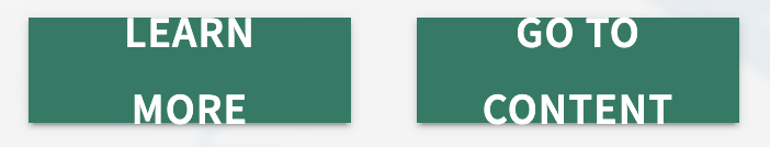
You can see that the size of the buttons reduced, which causes the text to break across multiple lines, which is expected. What isn't expected is that the text appears to align to the top and bottom edges. There is a simple way to address this so that resizing creates a better visual experience.
Open the Hive Designer and locate the buttons in question. Click on one of the buttons and in the Properties panel, locate the Text section from within the Background section. Select the Text Styles drop down to access the text settings. The text size, weight, font, colour, etc are all correct when the zoom is 100% so no need to change any of these properties. What does need to be changed is the spacing when the line breaks. Click on the Paragraph spacing property, which is set to Default, and change it to 1.
Save the changes to the Hive. Now when the page resizes, the buttons will resize, but when the text breaks, it will remain centered.
Another aspect to consider when designing a Hive to be responsive, is using a Grid as a layout type versus using a Canvas. When creating a new Hive, or adding a new page to a Hive, the default layout that is on the page is a Grid. The Grid provides the greatest flexibility when it comes to responsiveness, because the screen is divided into a grid pattern. When the size or zoom of the display changes, the grid reacts accordingly keeping all the content aligned. The Grid also snaps added content to the grid lines to ensure that the design elements are linear and askew.
The Grid layout provides some customization when it comes to the number of columns and the size of the individual cells. The default settings for a Grid layout object are 48 columns with a cell height of 48px.
For most designs, this Grid size will be sufficient, but in certain scenarios, the Grid size cell height should be adjusted to something smaller. One scenario is when working with small objects, like images, it may be easier to align the image with another object, like text boxes, when the cell height is smaller and thus more 'drop zones' are available.
While testing various zoom and resolution levels with this design, the image scale doesn't remain aligned with the text box. Shown here are 100% zoom, 125% zoom, and a reduced browser window size.
You can see that the image doesn't remain scaled to the accompanying text. But why is that? Let's take a look at some of the design decisions that were made. First the image that was being used was large and because the grid size was too big, the image couldn't be resized and placed in a centered fashion. If you look at the following image, you can see that the text is centered between two cells, because the container behind it is two cells high and the text option used was to center the text. Trying to shrink the image to a single cell, doesn't allow the image to be centered alongside the text.
The workaround, was to have the image span two cells and then introduce padding to shrink the image. Now while this worked for a regular browser size and a 100% zoom level, when the browser resized, and the grid cells had to change, the padding, because it's in pixels, is still respected, shrinking the available real estate for the actual image.
To compensate for the image size and the fact that the text is centered between two cells, the solution is to remove the padding and to change the cell height of the Grid. To provide more granularity in the Grid 'drop zones', a cell height size of 8 was selected, which produces a Grid with more placement options.
The next thing is to remove all of that extra padding on the image, which is no longer required because the image can be better aligned to the text with the reduced cell height.
Looking at the result above, the image seems a little squished to the left edge, so some padding can be added back to center the image a little further and to add a little white space between objects.
With these properties changed, when the browser resizes, or the zoom level is changed, the image remains proportional to the text.
When changing the Grid cell height size, it is suggested that the size doesn't get smaller than 8. When cells heights are too small, it can become difficult to align and place objects onto the page because there is too much granularity.
Create a Hive template
If a Hive design has been created, and that design will be replicated future Hives, it is highly advised that a Hive 'template' be created. Within this Hive, you would want to implement the desired branding, as well as the Hive and header appearance. This Hive should also contain the style of Landing Page that is desired, as well as (based on requirements), a stylized Story Board page, or pages depending on usage, as well as a stylized Catalog page. No content needs to be added to the Hive as we're just focused on the appearance that will serve as the starting point for future Hives.
Once the design is finished, you could name the Hive 'Corporate Template' and only allow visibility of the Hive for the Authors and Admin role members. When a new Hive is required, a copy of this Hive would be made and then the properties for the new Hive could be adjusted to match the requirements. If not all of the sample pages within the template are required, they could be hidden or deleted, but using this technique ensures that the branding and design is consistent between Hives, and that there is a similar look and feel ... and will save Authors a LOT of time.
Create Custom Author Roles
Digital Hive deployments that cater to a large user base, and that have many authors that will be contributing to the Hive creation process, it is advisable that custom Author roles be leveraged. The reason for this, is that if a single Author role is utilized, all authors will have access to edit all Hives. If this is not desirable, then to remedy the access problems, individual user accounts could be added to each Hive. While functional, this creates a significant increase in the effort required to maintain and manage all of the Access Control Lists. Instead, it is strongly encouraged to create multiple Author roles, which can be created for each Business Unit, Team, etc that will be required to author Hives. Once the individual roles have been created, they can be given the proper level of access to the necessary Hives, and then can pretty much be forgotten. When a new user joins the group and is given access to a custom Author role, they will automatically inherit the right access for the required Hives. Same for when a user leaves the role, or changes roles.
For more information about the capabilities required to create a custom Author role, please consult this article.
Use Images as Buttons
The Digital Hive authoring experience usually provides multiple techniques to accomplish a task. For example, Button objects can be added to create launching points for report, pages, external web sites or applications, and even for other Hives. While there are some customization options available for the Button object, like size, colour, icons, etc, they can still feel a flat based on the design that is being created.
Looking at the sample design above, four buttons have been added to the Hive page that will serve as a way for users to launch different Hives from this Landing Page. Some thought was given to the appearance of these buttons: colour matches the design, the icons align with the subject area, the size and spacing is consistent. The overall aesthetic fits the design and is functional, but what if some adjustments were made to elevate the design.
In the redesigned sample, some corporate images, that reflect the different areas of business, were used. Because the images are colour and contain numerous colours and shades, a colour mask was applied on top of the images to create a bluish tint and make them more consistent. The only change in the creation of this view, was that instead of Button objects being used, Image objects were added to the page and given the same size and spacing. Another alternative could be adding some text to the image, if the image selected doesn't already contain the required text.
Some people may prefer the icons over the images, text versus no text, and that's ok. Beauty is in the eye of the beholder after all. Every design is different and these techniques, and how they're implemented, may lend themselves better towards certain designs over others.
Ensure that either the images that are used are intuitive and represent the result of the click action, or add labels to the design
Secure Individual Hive Pages
It has been discussed that in most cases, it is better to ignore the temptation to create a single Hive that caters to all users, and that more focused Hives should be authored with a significant audience in mind. While following this guidance, avoid getting too granular. For example, let's look at a Hive being created for the Sales organization, which is made up of Account Executives and Sales Managers. During the Hive design phase, it is uncovered that the Sales Managers require a visualization that has a higher rollup of the Sales figures than what the individual Account Executive are permitted to see. Other than this visualization, all of the content that is accessed by the two groups is identical.
Instead of building a Hive for each group, it would be recommended that a single Hive called 'Sales' be created. A page would be authored that contains the Sales Managers' visualization, and then using the Page Access Control List, access to this page would only be granted to the Sales Managers role or individual users.
Use Corporate Colours in Reports
There is an easy way to instantly improve the overall cohesiveness and visual appeal of Hives, and it doesn't require any changes within Digital Hive. Creating and leveraging a corporate colour palette within the underlying BI systems will provide a more consistent look and feel when viewing content coming from multiple systems. Using a corporate colour palette should be a BI best practice, but it's surprising how many organizations rely on the default colours provided by each BI system. This issue is compounded when the default colours vary from system to system.
Assume that this is the official colour palette of an organization.
Applying this palette in IBM Cognos Analytics, for example, would transform this visual into a consistent appearance that would fit alongside content coming from other systems that leverage the same palette. The result is a common look and feel that creates a more integrated, cohesive experience, without very little effort.
Decompose Existing Visualizations
While we're on the topic of BI content, let's take a look at how the addition of BI content can be improved so that Hive pages are more focused and show only the visuals, KPIs, data that is required for the specific experience. When embedding BI content, some platforms provide mechanisms to leverage a subset of the larger visualization. For example, Microsoft PowerBI allows for individual dashboard tiles to be embedded, specific visuals on a Qlik Sense sheet can embedded instead of the entire sheet, Tableau provides the ability to embed a single page from a workbook, and it is possible to display a specific PowerBI report page as opposed to embedding all of the pages in the report. Employing this technique empower authors to create more impactful Unified Dashboards as only the necessary visuals can be included. This produces a result that is succinct and easier to consume for the audience.
However, not all BI and Analytics platforms provide this level of access to the content. In these scenarios, a copy of the report or dashboard would have to be made, and then the unwanted pieces stripped away. One alternative is to decompose a dashboard so that every visual is a stand alone piece of content that can be utilized by Digital Hive authors. This doesn't have to be done for all BI content, just the reports and dashboards that contain elements required for use in a Unified Dashboard or a Data Story.
Helpful piece of advice when working with PowerBI, individual visuals in a PowerBI report can be pinned to a PBI dashboard. This is a very easy way to isolate specific content from within a report and include it in a Digital Hive page
Use Tile Background Images
This is a simple technique to elevate your design and add some extra visual appeal. Take a look at the example below. An accent colour was used behind the content so that it breaks up the standard all-white design. Next, an embedded YouTube video and a text box were added as content. While this is a very simple design, it is functional and looks 'ok'.
Let's take this design to the next level. Find a complimentary image (colours, shapes, design, etc) in the corporate image gallery, or through Google, and then add that image to the background of the Grid or Canvas container.
If the background image is too distracting, use some of the Digital Hive image filters like opacity, contrast, brightness, etc.
Hive Page Background Images
Whereas the usage of background images within individual tiles can elevate and enhance the appearance of a particular section of a Hive page, the use of background images for the entire Hive can be a distraction ... if the wrong image is utilized.
For example, an organization in the lumber industry wants to bring some 'natural elements' into their design that is reflective of their business. A Hive author inserts an image of log ends as the Hive background image, producing a Hive page that looks like this:
From a visual perspective, one of the challenges with this design is that the background image has some dark areas and the pattern distracts from the analytics, which should be front and center in any design. By going into the Hive Designer and adding some image filters, Opacity and Saturation, it is possible to manipulate the image so that it is more subdued and becomes more subtle in the design.
When it comes to header design and the usage of background Hive images, a personal preference is to have a solid background colour, instead of the image, which makes the page tabs, search, etc, more visible. By adjusting the bottom slider of the colour picker for the Header, it is possible to add a little bit of transparency to the header so that some of the image lines bleed through, producing an interesting visual effect.
The mileage of background image and header modifications will vary based on the images, BI reports, and design elements that are included in the Hive, so the best approach is experimentation and some trial and error. Once the overall design has been nailed, it is strongly suggested that a Hive template be created from the finished design.
Create a Landing Page or Welcome Hive
The execution of this technique will vary based on your organization or the type of Hives that are being built, but the concept remains the same: provide users with an initial view that allows access to other areas of functionality. Typically these pages would be a little heavier on the design elements versus content items. For example, organizations talk about providing their users with a 'Netflix for BI' experience.
Looking at the design above, you can see that the first section of the page includes some introductory text, as well as a YouTube video explaining how to use Digital Hive as well as a message from the CEO talking about the rollout of the centralized Analytics Catalog and how it's going to change business outcomes. The section also contains a background image to punch up the design (shoutout to the previous technique). Scrolling down that page, you can see the Netflix experience take shape. There are different content lanes, personalized for each user, that provide easy access to different relevant reports, dashboards, and visualizations.
Here is another example of a Landing page that displays a Tableau visualization and a favourites content lane, but they are injected into the middle of different design visuals and text. This approach mimics a website and is a great way to convey necessary information to users, and the best part, it's a natural extension of how they are already used to consuming information.
If the subject matter, or design of the individual Hives doesn't lend itself well to a landing page for each Hive, then it is strongly recommended that a Welcome Hive be created that serves as the entry point for all users. This Hive could display the high level landing page content, contain links to their favourite reports or recommended content, and users could either use the Hive Launcher to access the other Hives, or links could be added to the page that would take the user to the required Hives.
If users typically visit more than one Hive during a Digital Hive session, reusing the landing page on each Hive may be too repetitive. This would be an opportunity to create a Welcome Hive.
Reuse Content Lanes through Copy & Paste
Many organizations are looking to deploy a 'Netflix for BI' type experience to their end users. This type of experience is possible within Digital Hive by using the Content Lane tile type. The Content Lane is an intuitive, personalized, content layout that exposes users to different types of content groupings: favorites, recommendations, interests, trending, most recently used, and specific folders. By laying out the various Content Lanes, a Netflix type experience can be assembled within a Hive.
Each Content Lane has it's own specific unique properties that ideally would be almost entirely consistent across the various lanes being used. The properties that will vary, are the Content Source and Display values. This means that to assemble the layout used in the example above, a lot of repetition would required for each Content Lane. The most efficient, and easier, way to accomplish this would be create a single Content Lane, adjust the properties, and then copy and paste that Content Lane for the other lanes.
Once the additional Content Lanes have been copied, and aligned to the page as required, simply go into each content lane and change the values for Content Source and Display to reflect the desired content.
Create a Data Story
This may be considered an 'advanced' technique by some authors, but implementing this approach can have a significant impact. The impact goes beyond visual appeal and could help elevate the understanding and interpretation of the actual analytics content. Data Stories are an emerging trend that provide users with textual summaries and data analysis from Business Analysts and/or subject matter experts. This is done to provide users with a consistent narrative around the data so that users have the same understanding of the different visualizations. Examining the Unified Dashboard below, that brings in visuals from Tableau, PowerBI, and Qlik Sense, there is a lot of data consume. This is very representative of dashboards that are encountered on a regular basis, and while functional, a lot of data interpretation is left to the user. This opens the door for user bias to enter into the analysis phase, and leads to different interpretation and understanding of a common data set.
Digital Hive enables authors to take these same visuals, present them in a different layout, and add textual summaries that guide the users to a better understanding of the data. Take a quick look once again at the previous visual and see how all of the visualizations are contained within a single screen, making it difficult to focus on certain areas. The lack of white space also decreases the 'breathability' of the overall appearance. There is also an absence of any contextual information. Now, take a look at the following image, which is a transformed version of the previous Unified Dashboard.
In this rendition of the visualizations, an executive summary was included at the top. The reasoning behind this implementation was that if someone was short on time, what is the key takeaway that they need to know. Think of this as the tl;dr (too long; didn't read) section of the page. As this is the essential part of the story, a coloured background was used, and the text colour was reversed. To reinforce the summary, the 4 KPIs that were used in the original design (down the right hand side of the dashboard) were added to a slider that is set to auto scroll every 6 seconds. This accomplishes two things. The first is that it maximizes the available real estate by swapping metrics or KPIs that typically users don't need to spend a lot of time to consume. The second is that the slider control introduces some movement and brings a dynamic element to the page increasing the overall aesthetic of the page.
The page design is then broken up into three sections. Although there aren't any line or colour separators between the sections, the symmetry of how the content is laid out creates a visual 'separation'. As you can see below, the first two visualizations are using different layout modes (portrait and landscape). By laying them out side by side, and then filling in the gaps with the required contextual analysis, a symmetrical 'block' was obtained. This layout works because both of the visuals pertain to regional data, and one visual (on the left) presents a macro view of the analysis, and the Sankey visual dives deeper into a problematic region, so both text blocks contribute to the same 'story'.
The second 'section' highlights a problem area that has a negative impact on the results. Because of this, similar to the formatting of the executive summary at the top of the page is applied. The text box size doesn't align to the height of the visualization, so it was centered against the visual. The text size could have been increased to better align the edges of the visual and the text box, but the design intent for this data story was to keep the text sizes consistent.
The last 'section' revolves around a common data element as well, sales. Only two of these visuals (bottom two) were included in the original dashboard design, but because the layout evolved from a single screen dashboard to a flowing, webpage like, data story, there was an opportunity to add a new visualization that contributes to the story, but was left out of the original design due to lack of real estate. The addition of this new visual enabled the text box to be shortened in length (it originally spanned both of the visual beneath it), to align the text box with the visual beneath it, and then to align the new visual to the existing one, creating the symmetrical design that was sought after.

Asymmetrical layouts create a certain visual aesthetic, but not everyone is a fan of the asymmetrical look. Use them sparingly and only if it makes sense for the content or design
Not every report or visualization needs to be turned into a data story, but for the high value reports, or for certain Hive audiences like executives, this technique delivers high impact and can transform the way that users consume analytics.
Reuse Pages from other Hives
Following all of the previous techniques, a great new page was created in a Hive that would make a great addition to other Hives. You could recreate the page in a different page, or the easier way, is to import the new page into the desired Hive.
Say that the Marketing Hive contains a great landing page, called Home, and you want to add that Hive to the current Hive that you're using. Open the Designer and using the page menu, select the Import pages option.
This will open a dialog that shows all the Hives that you have access to. Locate the 'Marketing' Hive and expand the details to see all of the pages. Select the desired page and press the IMPORT button too add this page to the Hive in the Designer.

This creates a copy of the page and is not connected to the source page, which means changes can be made to either page independently and will have no affect on the other page.
Related Articles
Digital Hive Designer Elements Used for Authoring Hives
Overview Digital Hive provides a very robust, zero code, authoring experience that enables authors to create visually stunning and impactful end user applications, called Hives. As part of the authoring process, there are different elements that can ...What is the best way to have a 'draft' version of a Hive page?
Question Some of our Hives contain manually created summaries of the visualizations on a Hive page. Periodic changes to the data require that the summaries be updated. Although this is an easy task to complete, the challenge is that the summaries ...Authoring for both Tablet and Desktop Users
Question Our user audience comprises both traditional desktop users as well as users who work with tablets. What is the best way, short of creating different Hives, to create a Hive that can cater to both user experiences? Answer There are two types ...How to 'Enable' Connector Content Within Digital Hive
Question Once the connector parameters for a content system have been successfully applied, how do I select the desired content from the source to appear within Digital Hive? Answer As part of the connector creation process, once the required ...Upgrading a Multi-Server Environment
Question How do you upgrade a multi-server environment? Answer Below are the steps to guide you through a multi-server upgrade. Backup both the primary and secondary environments Stop the Digital Hive services on both servers Launch the installer on ...